THE PUBLIC GALLERY
A VERSATILE YET UNCONVENTIONAL GALLERY SPACE THAT WELCOME COLLABORATIONS BETWEEN ARTISTS AND CURATORS OF ALL BACKGROUNDS
LEVEL R (ROOFTOP)
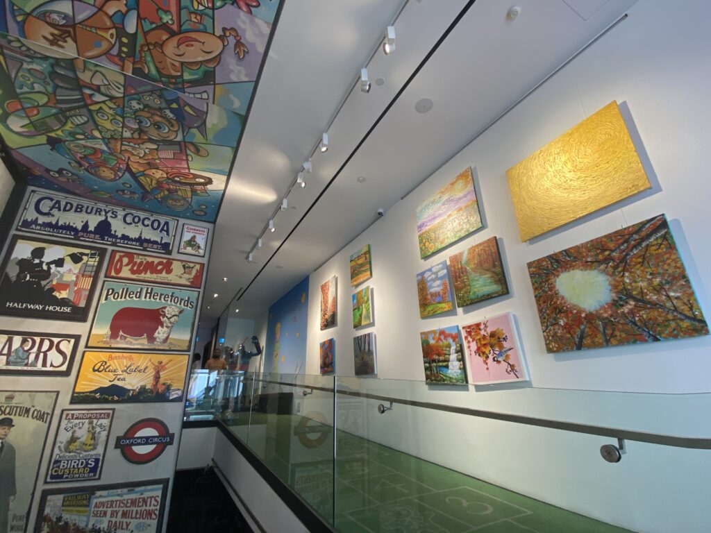
VINTAGE ENAMEL ADVERTISING SIGNS


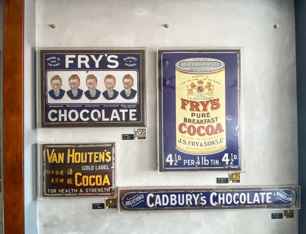
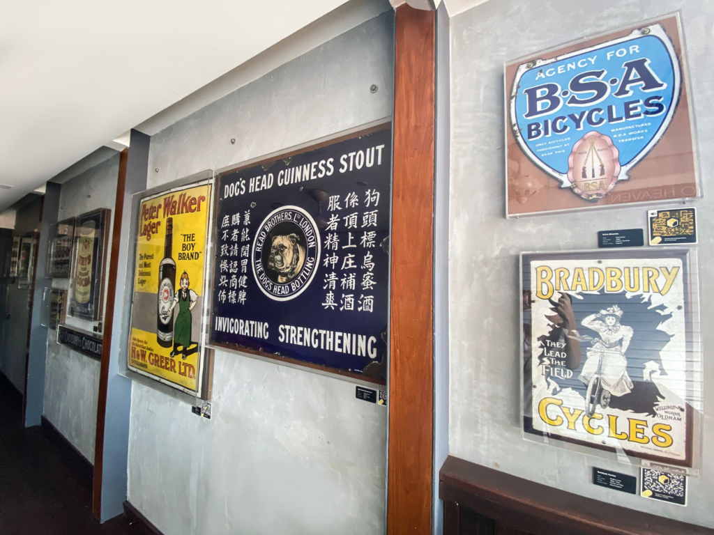
Enamel signs emerged in the mid-1800s as a form of advertisement for food, household items, petrol and a variety of services in the United Kingdom. Signs were constructed out of vitreous enamel, involving a process where coloured glass was fused to iron plates. Enamel signs were often displayed outdoors, using catchy slogans and vivid colours to attract customers; this led them to be known as “street jewellery”. Stores in the 1800s were often highly specialised, and relied heavily on enamel signs to not just inform shoppers about specific products for purchase, but also to act as an effective branding tool to set their wares apart from similar products. Due to advancements in printing in the 20th century, enamel signs were gradually replaced by cheaper advertising hoardings, and virtually disappeared by the 1950s.


ABOUT THE COLLECTION
This collection traces how vintage enamel signs document the many facets of everyday life for middle-class consumers between the 1800s to the mid-1900s. Two collections – Tasks at Home and Infant Care – investigate the domestic lives of women, while the Delicacies of the Middle Class collection offers a rare look at historic 19th century chocolate manufacturers. Or, discover the leisure activities of working and middle-class folk through the Industrial Alehouses and Travel and Transportation collections – which explore industrial drinking culture and innovations to transportation respectively.
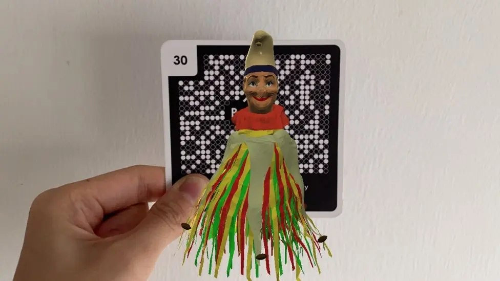
DISCOVER 1800S CONSUMER LIFE IN AR
Allow The Public Gallery’s wacky host, Mr Punch to introduce you some of the museum’s featured vintage enamel advertising signs reflecting mid-1800s consumer life in action!
BUILT THOUGHTFULLY AS A HYBRID BETWEEN AN URBAN VENUE AND EVENT SPACE AND AN EXHIBITION GALLERY, THE PUBLIC GALLERY AIMS TO BUILD A COMMUNITY OF CREATIVES WHO DARE TO DEFY CONVENTION IN THEIR ARTISTIC PRACTICE.
Featured Artists
LEVEL ONE
City of Leaf
Artist: Nathalie Auzépy

About the Artist
Nathalie Auzepy is a French creative director, space designer, and visual artist with over 25 years of experience. Her work is rooted in Eco-Humanism, sustainability, and positive equity, blending strategy and creativity to lead over 500 impactful art projects across architecture, sculpture, land art, photography, performance and museography. Collaborating with both private brands (Chanel , Hermès, Guerlain…) and public institutions, Nathalie creates works that are transformative, respectful, and socially conscious. She draws inspiration from ancestral art techniques, reimagining them in a contemporary context to connect past and present. Her practice is a reflection of her lifelong values and commitment to creating meaningful, responsible art: “Connecting what is connected”.
About the Art
“La Feuille de Ville” weaves together urban maps and leaf veins, connecting nature and urbanity in a harmonious and positive dialogue. It unites two seemingly opposing structures — the urban and the organic — to reconcile them in a powerful ecological and civic statement:
“MY CITY, + MY NATURE.”
A true symbolic spatial marker, it strengthens a unifying collective unconscious. From uniqueness (“My city, my neighborhood”) to the universality of a serial artwork, it embodies the values of a city or region.
Non-intrusive and made of polished mirror-finish stainless steel, it reflects its surroundings. Already present in Paris, Brussels, Kyoto, New York, Grand Rapids (USA), and now Singapore, it offers an eco-logical, humanistic, and organic vision of the city, tailored to the unique DNA of each place.
The visual diffractions orchestrated by light and shadow create an urban moucharabieh with cartographic effects. Nature, both powerful and fragile, subtly unfolds over the city. Like a Proustian madeleine, it evokes chestnut leaves fallen in schoolyards in autumn, whose soft parts we would peel away to reveal their inner structure.
Everything is structure—from the tiniest molecule to the universe itself. Rather than opposing them, City Leaf entwines urban and vegetal forms, allowing them to coexist in a new, unified, and benevolent whole. Emptiness absorbs fullness, and shadows, through shifting perspectives, overcome matter.
Suspended above its own shadow, the Leaf becomes a sensitive architectural symbol. Like a sundial, its shadow is precisely calculated to align, at a specific time of year, with a metallic imprint on the ground.
It thus becomes a landscaped garden—an artwork that binds space and time.
LEVEL ONE
The Reason of My Happiness is You
Artist: Nana Tedja

Year: 2023
Medium: Acrylic on Canvas
Dimensions: W2000 x L2000mm
Country of Origin: Indonesia
Nana Tedja (b. 1971, Yogyakarta, Indonesia) is a prominent contemporary Indonesian painter whose bold use of color and dynamic, geometric forms reflect her deep roots in Javanese visual culture.
A graduate of the prestigious Indonesia Institute of Art (ISI), she holds a Master of Fine Arts and has quickly become one of Southeast Asia’s leading female artists . Her works have been showcased across solo and group exhibitions in Singapore and Indonesia, including recent shows at Gallery 1819 and featured in regional art fairs.
Nana has participated in landmark events like Art Moments Jakarta and through her art, she challenges norms and advocates for greater representation of women in Indonesia’s art scene.
LEVEL ONE
Essence of Seasons
Artists: Touch Art (SAVH)

A captivating collection of canvas paintings inspired by the essence of seasons – Autumn, Summer, Winter and Spring, done by the visually impaired clients of the Singapore Association of the Visually Handicapped.
This exhibition of canvas paintings will be on display until 30 June 2024 only.